The realm of interior design is an intricate dance of colour and texture, each element playing a pivotal role in creating a harmonious and inviting space.
Colour ignites emotion and sets the mood, while texture adds depth and tactile interest, making a room not just seen, but felt.
At SB Decorations, we’ve put this blog together that delves into the advanced techniques of balancing these critical components, aiming to guide you through the nuanced process of designing a space that’s both visually captivating and emotionally resonant.
Understanding Colour Theory in Interior Design
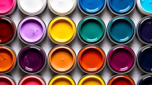
Colour theory is fundamental to interior design, as it informs the choice of colour schemes that will influence the room’s atmosphere. The colour wheel, comprising primary, secondary, and tertiary hues, serves as a guide for creating colour harmony.
Complementary colours, found opposite each other on the wheel, offer a vibrant look, while analogous colours, sitting side by side, provide a more harmonious and subtle approach. Moreover, it’s essential to understand the psychological effects of colours.
For instance, blues and greens evoke calmness and tranquillity, making them ideal for bedrooms or study areas, whereas reds and oranges are energising, and suitable for living spaces where activity is encouraged.
However, it’s not just about picking the right colours but understanding their interactions. Lighter hues can make a room feel more spacious, while darker tones tend to create a cosier atmosphere.
The key is balance – using a dominant colour to anchor the space, complemented by secondary and accent hues to add dimension and interest. This approach prevents colour from overwhelming the space and allows for a more refined and sophisticated palette.
The Role of Texture in Interior Design
Texture plays a crucial role in interior design, offering a counterbalance to colour by adding visual weight and depth. It’s the element that makes a space inviting and interesting.
Textures come in various forms – from the smooth, cool surfaces of marble and metal to the warm, soft feel of wool and velvet.
Each texture contributes a unique sensory experience, influencing not just the aesthetics but also the atmosphere of a room.
For instance, a leather sofa adds a different level of sophistication and ruggedness compared to a velvet one, which exudes luxury and comfort.
Balancing texture is as vital as balancing colour. A room with too many similar textures can feel flat and monotonous, while an overabundance of contrasting textures can create visual chaos.
The secret lies in finding a middle ground – pairing rough with smooth, matte with glossy. This contrast not only accentuates each texture but also helps to distribute visual weight across the room.
Moreover, textiles play a significant role in this balance. Rugs, cushions, and curtains are not just functional but also serve as tools to introduce and harmonise different textures within a space.
Techniques for Balancing Colour
When balancing colour in a room, it’s important to start with a base or dominant colour. This colour sets the tone for the room and is usually applied to large areas like walls or significant pieces of furniture. The dominant colour should resonate with the desired mood of the space.
Next, incorporate accent colours to create depth and interest. These should complement the dominant hue without competing for attention. For example, in a room with a soft blue dominant colour, accents of warmer shades like mustard or terracotta can add a pleasing contrast.
In addition to choosing the right colours, the way they are applied plays a crucial role. Gradient schemes, where a single colour is used in varying shades, can create a serene and cohesive look. On the other hand, using high-contrast colours in small doses can bring energy and vitality to a space.
The key is to maintain a balance that neither overwhelms nor bores the senses. Remember, lighting also affects how colours are perceived, so consider the source and intensity of light when selecting your palette.
Techniques for Balancing Texture
The art of balancing texture in interior design lies in the strategic layering and placement of different materials. Start by identifying the primary texture of the room, which could be anything from a plush carpet to a sleek hardwood floor.
Then, introduce contrasting textures to create a sense of balance and interest. For example, against a smooth, glossy floor, a shaggy rug or a velvet sofa can add a soft, inviting feel.
The juxtaposition of these textures not only enhances their individual qualities but also adds a dynamic visual appeal to the space.
Lighting plays a significant role in highlighting textures. Natural light can accentuate the natural beauty of textures, while artificial lighting can be used to create shadows and highlights, adding drama and depth.
Consider the placement of lights and their intensity to ensure that textures are showcased effectively. Furthermore, it’s essential to avoid over-cluttering with textures. Too many different textures in a small space can make it feel chaotic and unorganised.
Aim for a balanced approach by limiting the number of contrasting textures and focusing on complementary ones that enhance the overall design narrative.
Colour and Texture in Different Interior Styles
Each interior design style employs colour and texture uniquely. For instance, minimalism often features a monochromatic colour scheme with varied textures to add interest without clutter. In contrast, a bohemian style embraces a more eclectic approach, combining rich, vibrant colours with a mix of textures like woven fabrics and natural materials.
Understanding these style-specific nuances is key to creating an authentic and cohesive look. When applying these principles, it’s crucial to consider the overall theme and ensure that both colour and texture choices support and enhance that theme.
For example, in a rustic setting, earthy tones and natural textures like wood and stone would be more appropriate than high-gloss finishes and bold, primary colours.
In more modern and contemporary designs, a balance of colour and texture is achieved through the use of sleek materials and a limited colour palette, often featuring bold accent hues against neutral backgrounds.
Here, the texture is often subtle, relying on the interplay of light and shadow to add depth. In traditional interiors, richer, deeper colours are often balanced with luxurious textures like velvet and silk, creating a sense of opulence and timelessness.
The key in any style is to maintain a sense of harmony and flow, ensuring that no single element overpowers the others, but rather, they all work together to create a unified and pleasing aesthetic.
Common Mistakes to Avoid
One of the most common mistakes in balancing colour and texture is the overuse of bold colours or heavy textures, which can overwhelm a space and make it feel chaotic. It’s important to limit the use of strong colours to accent pieces or small areas and to balance heavy textures with smoother, simpler ones.
Another mistake is being too matchy-matchy with colours and textures, which can create a flat and uninteresting look.
Instead, aim for a harmonious but varied palette that adds depth and interest to the space.
Another pitfall is neglecting the role of lighting in how colours and textures are perceived. Natural and artificial lighting can dramatically change the appearance of colours and textures, so it’s essential to consider the lighting conditions in a room when making design choices.
Additionally, overlooking the scale of patterns and textures can lead to a disproportionate look. Large patterns or textures in a small room can feel overpowering, while small patterns in a large space can get lost. Always consider the scale and proportion of these elements in the room size.
Practical Tips and Tricks
When experimenting with colour and texture, start with a neutral base and gradually layer colours and textures through accessories like cushions, throws, and rugs. This approach allows for flexibility and easy updates.
Using fabric swatches or paint samples can help visualise how different colours and textures will work together in a space before making any significant changes.
For DIY enthusiasts, simple projects like repainting a piece of furniture, adding a textured wall hanging, or creating a feature wall with a bold wallpaper can be a great way to experiment with colour and texture.
These small changes can make a significant impact and are often an affordable way to refresh a space. Remember, the goal is to create a balance that feels harmonious and reflects your style.
Conclusion
Balancing colour and texture in interior design is an art form that requires a thoughtful approach. By understanding the principles of colour theory and the impact of texture, and by avoiding common pitfalls, you can create spaces that are both aesthetically pleasing and emotionally resonant.
Remember, the key to successful interior design is balance – allowing colours and textures to complement and enhance each other, creating a cohesive and inviting space.
This blog aims to provide you with the knowledge and inspiration to experiment with colour and texture in your own home confidently.
Whether you’re embarking on a full-scale renovation or just looking to refresh a single room, these advanced techniques will help you create a space that is uniquely yours, both in style and substance.