Creating a cohesive colour scheme across multiple rooms can significantly enhance the aesthetic appeal and harmony of a home. This guide provides practical tips on selecting and coordinating colours to achieve a seamless flow throughout your space.
Understanding Colour Theory
To begin, it’s essential to grasp basic colour theory. The colour wheel consists of primary, secondary, and tertiary colours, which can be combined in various ways to create harmonious palettes. Common harmonies include analogous (colours next to each other on the wheel), complementary (colours opposite each other), and triadic (three evenly spaced colours).

Setting the Foundation: Neutral Base Colours
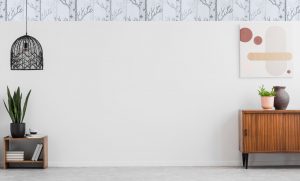
Neutral colours like whites, greys, and beiges serve as a versatile base, allowing for flexibility in accent colours. These tones can create a calming backdrop and seamlessly transition between different rooms.
Creating a Cohesive Colour Palette
Start by selecting a dominant colour for your home, which will set the overall tone. Complement this with one or two accent colours that can be used sparingly across different rooms to tie the spaces together.
Transitioning Between Rooms
Achieving a smooth transition between rooms involves subtle changes in hues. Consider using similar shades or undertones to maintain continuity. Highlight architectural features like mouldings and doorways with consistent colour choices.

Balancing Bold & Subtle Choices
While bold colours can add character, they should be used judiciously. Feature walls and focal points can introduce vibrant hues, while softer tones elsewhere maintain balance and prevent overwhelming the space.
Considering Lighting & Room Function
Lighting significantly impacts how colours are perceived. Natural light can make colours appear brighter, while artificial lighting can add warmth or coolness. Tailor your colour choices to the function and mood of each room—for example, calming colours for bedrooms and energising hues for living areas.
Using Patterns & Textures
Patterns and textures can add depth and interest to a colour scheme. Mix patterns thoughtfully, ensuring they complement the overall palette. Additionally, textured elements can enhance the visual appeal and balance the colour scheme.

Personal Touches & Accessories
Incorporate personal style into your décor through unique colour combinations and accessories. Artworks, cushions, and other décor items can reinforce the chosen palette and add personality to the space.
Practical Tips & Common Mistakes to Avoid
Consistency is key when coordinating colours across multiple rooms. Avoid overusing bold colours or neglecting the influence of lighting. It’s also crucial to test paint samples in different lighting conditions before making a final decision.
Conclusion
A well-coordinated colour scheme can transform a home, creating a harmonious and visually appealing environment. By understanding colour theory, setting a neutral foundation, and thoughtfully selecting accent colours, you can achieve a cohesive and stylish look.
For professional advice and services, consider reaching out to our expert team for a consultation. Let’s bring your vision to life with expertly coordinated colours.